In all the arguments that swirl around the brutalist architecture of the postwar era I'm much more interested in form rather than function. Maybe because I don't have to live in Robin Hood Gardens, some might say. But even so I do think there is something beautiful about many of these buildings. Actually, I'm not sure beautiful is the right word on reflection. Perhaps extraordinary works better. Last year I visited Preston and the bus station is the thing that has stayed in my memory if only for the ambition and excessiveness of architect Keith Ingham's design. "The station is a thing of swoops and curves," according to architectural critic Jonathan Glancey, who has described the building as "cinematic, sculptural, heroic" and a "20th-century baroque cathedral".
It is architecture as a Kubrick film set, Glancey suggests and there is certainly something clean-lined,overpowering and monumental about it, a structure that you could imagine Stanley might have responded to.

Coincidentally, yesterday I got a chance to have a very quick look around the retrospective exhibition of Toby Paterson's work in the Fruitmarket Gallery in Edinburgh.
Paterson has spent the best part of a decade using his art to explore and rediscover the romantic intentions of postwar architects. His paintings recreate brutalist architecture from around Europe, juxtaposing and dissecting details and, through colour and design,I don't think it's not too much to say, beautifying the buildings.
What's interesting about the exhibition can be found in the downstairs section (the upstairs "ethereal" section is too empty for my tastes). Down here, painting and plan and model are piled on top of each other in a dense concatenation that simulates the urban cityscape. Better still, Paterson's paintings on perspex allow one to see other work through the one that is immediately in front of you, to catch it from oblique angles and corners.
Wandering around I found myself recalling walking down the well-heeled spruceness of Grey Street in Newcastle last year with the bulk of the Trinity Square Car Park (familiar to film fans for its appearance in Get Carter) floating ahead of my vision on the horizon. And of sitting in the cafe of the LRB bookshop in London earlier this week, supping soup while looking out at the Post Office Tower perfectly framed by two Bloomsbury streets in my eyeline.

I've always found Paterson's art beautiful in its clinical precision, but I would concede that seen individually they could appear academic. The Fruitmarket show removes that possibility. Here they aspire to urban complexity.
Of course in their romantic perfectionism, Paterson's paintings and models are also unreal. The Fruitmarket's accumulation of Paterson patterns is a wonky simulation of the urban landscape because they're too perfect, too pretty.
The fact is that even if I do want to argue that the Preston Bus Station has a kind of beauty to it, it would be misleading not to acknowledge that it's a shop-soiled beauty at best, a rundown, weather-beaten, rain-dirty beauty.
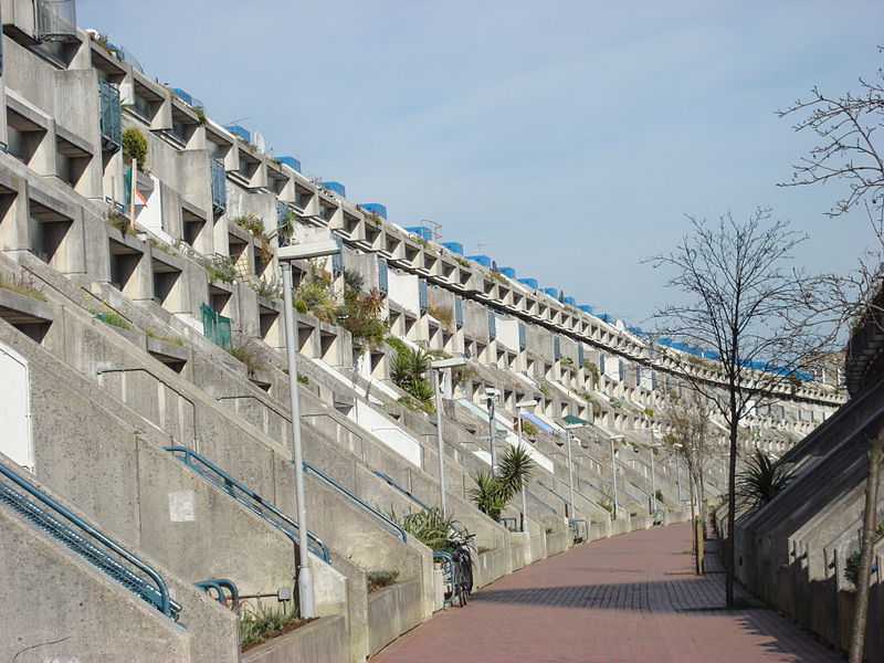
Now and again that grimy, gritty, bulky beauty is captured on the big and small screen. One of my guilty pleasures on TV last year was Channel 4's riff on "what if Skins was crossed with superheroes" drama Misfits. One of its many cheap pleasures was the choice of location - on and around the modern architecture to be found near Southmere Lake in Thamsemead, south-east London. The programme makers don't make any statements abut the architecture. It would appear to be just something that caught their eye and they liked the effect of it in front of the lens. It simply looked interesting.
You can see the same kind of approach in the late Anthony Minghella's film Breaking and Entering when the director turned his camera on the 1968 estate Rowley Way, a kind of recognition of the novelty of this urban space when it's removed from the social and poltical context in which it exists in reality. (Minghella might have argued that he wasn't blind to the politics. After all, he places the film's Bosnian immigrants in Rowley Way,an acknowledgment that modern architecture has become - in tabloid terms at least - home to the low paid and unpaid. Yet the film's gaze rather glides above that subtext and just enjoys the patters it sees.)
I'm always surprised by how much location filming actually happens in British cinema. Even a cursory glance disproves the notion that postwar Brit movies play out in the drawing room In recent movies I've caught glimpses of such postwar British thrillers as The Blue Lamp and League of Gentlemen and been pleasantly surprised by how much of these films happen on the British street.
At the same time, though, I'm struggling to think of a British film that uses architecture as an organising principle. I can think of a couple of film-makers - Nic Roeg in Don't Look Now,a film as twisted and twisting as the Venice streets it's filmed on. And John Boorman's vision of Los Angeles in Point Blank. But both men are looking at foreign cities not British ones, so they don't count.
And it's interesting to compare the way Minghella uses Rowley Way, for example, with the way Matteo Garone uses Napolitan locations in his Italian mafia film Gomorrah, in which the city's modern architecture is revealed as one giant trap (not a very kind vision of brutalist buildings, but as a visual metaphor it works).
I'm half-bluffing here, but I wonder if there isn't some kind of symmetry between modernist architecture and modernist cinema. They seem conjoined. Think of the way Antonioni used architecture to frame his characters. Perhaps it says something about our cinema and our cities that the connection isn't as obvious on this side of the channel.
Or maybe I'm just missing the obvious example. There was one film that used the same locations as Misfits and possibly - I have never actually seen it - in a more forensic manner. Stanley Kubrick's A Clockwork Orange. (TJ)
No comments:
Post a Comment